10 pricing and packaging optimizations you should prioritize, like yesterday.
High-impact experiments you can (and should) be running.
In a recent newsletter, I introduced the Monetization Council™ - a cross-functional dream team in charge of the big, strategic “how do we make money” decisions.
But today we’re talking about everything outside that council. The scrappy, no-permission-needed, high-impact experiments you can (and should) be running right now.
The best part? You don’t need to mess with your pricing model to see big wins. Just sharp design, clever defaults, and a little creativity to make your conversion rates go.
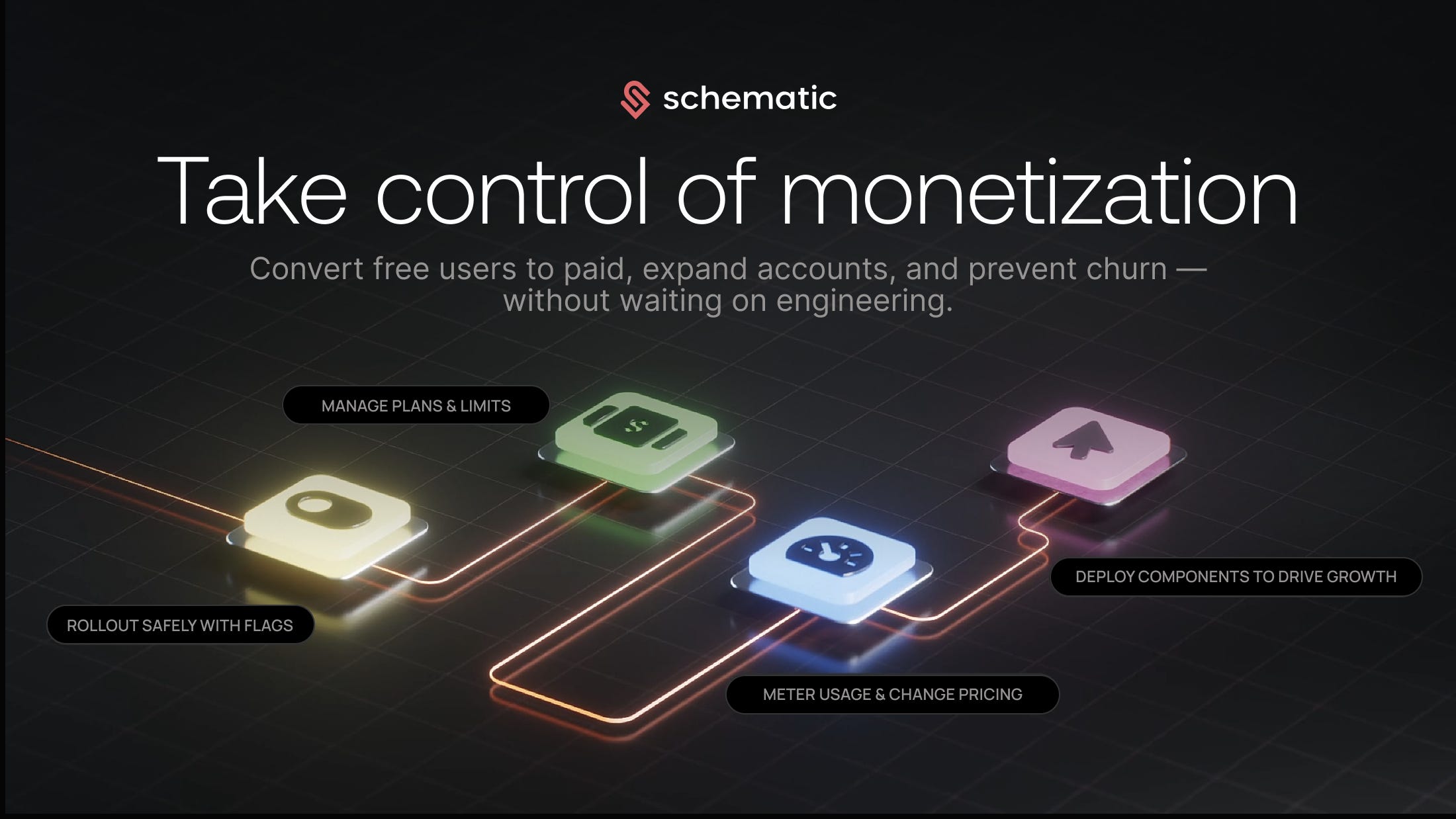
This post is sponsored by Schematic: Schematic gives growth and product teams full control over pricing & packaging - without code changes. Configure usage-based plans, add-ons, paywalls, and enterprise exceptions in minutes, not months. Check them out →
Here are 10 monetization optimizations your Growth team should be running.
1. Default new users into a reverse trial
I'm very passionate about companies testing reverse trials - so much so that I wrote a whole article on the topic.
A couple of things you need for this to work:
Your product has a freemium
It is possible for a free customer to try *some* version of the paid plan without bankrupting your business
A standard freemium user journey typically looks like: users sign up for a freemium account, maybe hits feature walls, and get prompted to start a trial or purchase the paid plan.
The reverse trial flips the flow: users sign up and immediately get access to all paid features for a limited time - "Congratulations! We've unlocked all premium features for the next 7 days. No credit card required.” The user is able to experience the full value of the product upfront, while activating, and when it’s taken away, they feel the pain, driving an upgrade.
In other words, reverse trials play the psychological game of “take it away” - you get the premium experience first, then lose it unless you upgrade. Traditional trials and upgrade paths? They’re all about “pay to play” - you only get the good stuff after you commit.
Reverse trials usually result in ~20% lift in conversion - assuming high utilization of paid functionality within the reverse trial window (which is a very critical point!!!).
2. Restart trials over time
Many companies treat trials as one-and-done.
After the trial ends, users are forever stuck in freemium, or they have to wait for a long period (often a year) until they become eligible for a free trial again.
Don’t do this!
Users need paid functionality at different times, depending on what they're trying to accomplish and the complexity of their use case. On average, it takes 2-3 trials to upgrade a free customer to paid. So make sure you’re giving them the opportunity to experience those trials. Channel your inner Oprah here:
Here are a few ways you can achieve this:
Set a timeline: Every six months or so, reverse trial your entire user base. Tesla did this with the autopilot feature, enabling it for all cars without notice. The result? You guessed it: a ton of upgrades.
Coincide with product launches: Usually, product teams do big releases once or twice a year. These are great moments to offer a free trial to your user base. The message you’re sending is: "We've launched amazing new features, and you get access to them for the next 30 days, on us". It’s highly effective to drive engagement in the new functionality, and it might even resurrect some existing customers.
Trigger by user action: When a user hits a feature wall, offer a trial that includes all the paid features, not just the one that triggered it.
The first two approaches have an added benefit: they create urgency. Instead of communicating that a trial is available whenever users want it, you're saying "the clock has started, and you only have 30 days to experience this.”
This strategy works best for products with a large freemium user base or a big pool of churned users just waiting to be resurrected with the right nudge.
3. Experiment with monthly vs. annual default
In subscription businesses, how you frame pricing - monthly or annual pricing default - has a big impact.
Default to monthly subscription term: You’ll get 10–30% more paid subs... but churn will eat you alive, often wiping out any increase in conversion.
Default to annual subscription term: Fewer paid subs, but far better retention, often leading in significant lift in bookings/revenue within 3 year horizon.
But! There’s no one-size-fits-all. You should capture both benefits by segmenting your customer base:
Mature markets with good monetization should be optimized for retention: Default to annual. Retention > a few extra paid users. For most companies this applies to US, UK, CA, AU, and even EU.
Early markets that are still gaining traction should be optimized for conversion: Default to monthly. You're optimizing for conversion, not long-term LTV - yet.
This lever can drive significant upside in both new paid subs and retention.
4. Migrate customers from monthly to annual
Even if a customer starts on a monthly plan, your endgame should still be an annual subscription term. After all, would you rather have 12 chances to churn a customer or just one? I thought so too.
A simple “Get 3 months free when you upgrade to annual” message - delivered in-app and via email - can do wonders. Here is a good example of how Groove did it, increasing their annual upgrades 10x.
But timing is everything. Don’t pitch this too early. During the first month, users are still deciding if your product’s a keeper. Wait until they renew - that’s your green light. They've signaled trust, and now’s your moment to lock in a longer commitment.
Done right, you can convert ~20% of monthly users to annual. If you're not seeing that, you're likely leaving retention (and revenue) on the table.
P.S. If anybody from Spotify is reading this, can you ffs implement this already? You are leaving so much retention on the table…
5. Optimize your pricing page
The pricing page may well be the most important page on your site. And yet… so many companies don’t think about it strategically (or even worse, treat it as some sort of marketing landing page. EW.). Either they just don’t pay attention, or they’re afraid to touch it because they don’t want to break something so important to monetization.
But small design changes can lead to massive returns.
I wrote a newsletter detailing the DNA of a great pricing page. Check it out here, it has a bunch of optimizations you can start applying today:
As a benchmark, you should have at least 15% of your pricing page traffic proceed to the checkout page.
6. Simplify your plans in emerging markets
Most companies have 3-5 plans in their pricing structure, going from entry-level to enterprise.
Sure, it makes sense - but not everywhere. The enterprise plan is usually there to address higher complexity in markets where you’re doing really great. But this is far from a global phenomenon. And without intending, you might be scaring away potential customers.
When a user in an emerging market lands on your pricing page and sees those astronomical enterprise figures, the simple presence of those high numbers creates pricing anxiety. Suddenly, even your entry-level plan feels expensive by association.
Here’s how you can fix it.
Create market-specific pricing pages that remove those higher-end plans entirely in markets where you have good user adoption but struggle with monetization. In some cases, I would even simplify it down to just one plan.
I’ve seen 20–30% conversion lifts just by doing this.
7. Connect feature walls to the pricing page
Users hit a feature wall. They click through to your pricing page. And suddenly they’re lost.
Most pricing pages don’t acknowledge where the user came from or what they’re looking for. So users are left scanning a comparison table trying to guess which plan includes what they want.
There’s a simple way to fix this.
Tag each feature with UTM parameters and then highlight the relevant plan on the pricing page with a message that communicates: "The feature you were looking for is included in this plan”.
Bonus points if you track all the paid features users have hit walls on, and then show a tailored message explaining exactly which plans unlock all of those features. Think of it almost like keeping a shopping cart for each user’s upgrade intent.
I’ve seen ~10% improvement to conversion rates with this tactic.
8. Design for monetization awareness
Most conversion problems don’t happen because your monetization model is wrong. They happen because users have no idea how you're monetizing, what plans are available, or which features are included in paid tiers.
It’s shocking to me how little thought goes into showcasing premium functionality to users who don't have access to it. A simple question of: “How will users in lower tiers see this feature?" results in crickets. Every. Single. Time.
But we can address this with two simple changes:
In your design reviews, make it mandatory to review the experience of how feature walls look for customers who don't have access.
Create a consistent visual language for premium features. Let’s say your action buttons are green, so make monetization upsells a different color - gold, green, purple, etc. This pattern trains users to recognize premium features throughout your product.
Go the extra mile: list the top 5 reasons anyone would upgrade to each of your pricing tiers, then audit your product to see how visible those features are. Most companies discover they barely ever showcase their premium functionality.
Slack had one of the most iconic “easy win” monetization moves: Just by showing a simple “Upgrade to unlock full message history” prompt, they saw a double-digit boost in conversion.
Repetition is everything to achieve maximum recall, so this message shows up contextually in many places.
No pricing overhaul. No fancy funnel. Just the right message, at the right moment. One of the biggest (and laziest) monetization wins ever - and it worked like magic.
9. Handle overages the right way
These days, most products have usage thresholds in their pricing. When users hit these limits, you can deal with it in two ways:
The worst approach: Cut users off completely when they hit the limit. This interrupts their workflow and removes your leverage to drive an upgrade.
A better approach: Allow some overage (to an extent, don't bankrupt yourself!), with clear messaging about the limit. Then offer a choice: they can either pay for the overage or you’ll forgive the overage in exchange for an upgrade. This is a fantastic tactic to drive paid users to higher plans or to purchasing add-ons.
10. Discount strategically
When your product fits both personal and professional use cases, consider strategic discounting for specific segments that have weaker purchasing power, like startups, non-profits, educational institutions, or students.
Student discounts (25-50% off) are particularly ROI-positive. These are future workers and corporate employees, and getting them familiar with your product creates a pipeline of users who will eventually bring your tool into their workplaces.
Startup programs is another seriously underrated growth lever.
You give startups a free or discounted ride for a year or two - let them build habits, integrate deeply, and grow. Then, once they’ve got traction (and budget), boom, you monetize.
Everyone from HubSpot to Amplitude, Miro, MongoDB, and AWS is doing it. It’s not just generosity - it’s strategic seeding. Don’t sleep on this play.
Keep optimizing
Monetization optimization should be an ongoing stream of tests and improvements. There are always different sub-segments, personalizations, and tweaks you should be exploring. It’s a gift that keeps on giving - AND your highest chance of hitting those in-year revenue targets your company has set.
Edited with the help of Diana Bernardo.